Every once in a while, someone makes a mistake.
I did. Â The 5C actually sold pretty well. Â It was the 2nd most popular smartphone.
Oops.
</excuse_to_show_off_design>
REDESIGN IN PROGRESS
Every once in a while, someone makes a mistake.
I did. Â The 5C actually sold pretty well. Â It was the 2nd most popular smartphone.
Oops.
</excuse_to_show_off_design>
Bear with me for a moment.
System-wide third-party keyboards.
Buttons that can launch custom actions from within the sharing section.
System-wide third-party keyboards.
Beats Music acquisition just for another Steve Jobs.
SYSTEM-WIDE THIRD PARTY KEYBOARDS.
Are you getting it? Â These are not just android features anymore. Â Now they will be available for all iOS users.
*cue Steve Jobs’s ghost dying and a very loud playback of “Don’t Stop Believing”
When Steve Jobs told Tim Cook not to emulate him, Tim listened. Â And instead of stalling and exploding into a pit of slag like the WHOLE WORLD was expecting, Apple continued to innovate and push the envelope.
Ever had a problem where you left off on a project on your Mac and had to search for the program, open it, and open your document on your iPhone/iPad? Â No more. Â Now, the Mac realizes you left off somewhere, and will tell your phone/tablet/phablet, and your phablet tablet phone will prompt you on the lockscreen to open the document that you last had open on the Mac. Â It’s called Handoff. Â It makes sense. Â I want it.
I can definitively say that Apple still has that magic touch.
—
Now for the awkward moves that Apple has pulled. Â Namely, the 5C (which I haven’t heard a lick of since that weird dots ad campaign), and the Beats acquisition.
The 5C…hmm. Â It had color. Â It fit in with iOS 7. Â It felt fun…but…it just wasn’t right. Â People reacted the same way that they did with iOS 7, except this time it wasn’t the colors, it was the plastic. Â It might have been called poly-something-or-other, Apple may have said “we had no interest in imitating the typical, fragile plastic phone“, but dude…it’s plastic. Â A material usually associated with cheap phones and/or baby’s toys. Â Even if God built it…it’s plastic. Â People will assume it will break if you so much as drop it on carpet. Â It’s PLASTIC.
Also $600 iPhone vs. Free Firmware. Â Who wins? Â Apple, I’m going to tell you this for your own good: Please Try Again.
Steve Jobs would have thought of this…if only Apple had hired another perfectionist who knew what people would want before they did…
Oh wait, they have! Â Dr. Dre! Â Of BEATS. Â A MUSIC COMPANY. Â NOT RELATED TO ITUNES MUSIC/RADIO.
They also make headphones. Â Every single market analyst was stunned. Â They hit Ctrl+Alt+Del accidentally on their stock market computers and crashed the stock market (lawl i made a joke).
Here’s what I think: Â Dr. Dre is a perfectionist, right? Â What drives Apple? Â Perfectionism. Â Awesome build quality, awesome software quality, the Magic Moment, building things people don’t even know they want until they use it!
QED. Â Apple has just bought a second Steve Jobs.
Apple. Â Bought. Â Innovation.
Chew on that and tell me how it tastes. Â Does it taste like shit? Â Does it taste as bad as Apple hiring that iOS jailbreaker a while back? Â What? Â That tastes like shit too? Â I don’t know what you’re talking about.
Some people say Apple just wants Jimmy Iovine. Â And you know what’s funny? Â This post was originally going to ask “Who the fuck is Jimmy Iovine??” Â Then I actually checked his Wikipedia article. Â You can tell I don’t follow Beats very much. Â But the article dosen’t say whether he’s a perfvectionist like Dre.
But here’s the thing. Â We know that Dre is signing up as an executive. Â But we don’t know where Jimmy is going to go. Â He was hired, we just don’t know what position he was hired to be in. Â Is he going to be CEO, CCO, CBO, design nerd, replace Craig Federigi or Jony (please not Jony)?
Time will tell what all this nonsense means. Â That or Apple will explode into slag before they finish their new campus.
Apple uploaded a video on YouTube (yes Apple uses Google somehow) that proved that Apple isn’t turning into Toys ‘R Us but instead is turning into Arbor Day Inc.
Which means that it’s trying to make everything better. Not somewhat better, not awesomely better, just better. Seriously, that’s the entire title of the video: “Better”. Look it up (search for Apple as a channel, don’t actually search for the title).
Now I’m not quite sure what iOS 7 was. Was it flat because it wasn’t depicting real materials and thus was “greener”? Was it colorful because…I don’t know?
Whatever. People are calling it modern so fuck it, I’m sure Apple knew why iOS 7 is better.
“‘Better’. It’s a powerful word.” – Better Tim Cook, a Better Apple, “Better”, Better YouTube
…the iPhone 5c wasn’t better…
First I’d like to say everyone think different.
Now I’d like to say everyone follow your competitors and the smell of sexy greenbacks. And I don’t mean women with green backs.
Yeah.
So Apple is making a phone with a larger screen. I don’t know if that rustles any jimmies, but it’ll make things hell for developers. Or it would, if every element wasn’t able to just be substituted for a different size via the magic of templates, and not only that, every single element is basically a wire frame and can thus be vectored very easily.
I can hear you yelling at your screens that I’m defending Apple, and that what I should be doing is talking about the iPhone 5c and the massive miscalculation that both Tim Cook AND Jony Ive made of how well a phone with a colorful plastic backing would sell. After all, this is Apple we’re talking about. Innovative, serious, cool, techy Apple…right?
No. Or at least, not really so much anymore.
Take the iPhone 5c and iOS 7. What was the selling point of both? Color and fun. The 5c was a breath of fresh air from the black and white lineup, and iOS 7 was the same thing. Apple is completely changing. Changing from a company of innovative sleek devices that “just worked” (except when they didn’t), to a more open, happy company.
Do I like the change? Not particularly…but I won’t mind it if they keep the same build quality and software quality that they’re known for.
I did love the feeling I got when I used iOS 7 for the first time. I wish I had gotten a 5c now. But Touch ID is fun too.
I wish I knew what the iWatch looked like. A colorful plastic Nike-like band isn’t what the world is looking for. That I can say with 100% certainty. (laughs)
There have been many concepts, but honestly I can’t tell what it will look like. I can tell you this though: It won’t have a chrome-black color scheme.
I’ll leave the internet to fret over that.
I went there, and here’s why I did:
Every app, even Apple’s own apps, cannot play nice with this thing. Well they can, but they don’t know how to be a consistent program. Well they can, but…
Well, I have 11 copies of “Apple Keynotes” in my podcasts app right now.
Could be because I spent a long time trying to get my stupid iPad 2 to cooperate with my Photos app.
Or maybe it’s because the Podcasts app sometimes fails to play episodes and says they’re unavailable from the site even though I know iOS 7 is a lying broken mess and…sorry. I’ll never do that again, tell Jony I love him but he really should’ve…huh, what other option was there…
I’ve been asking myself if Jony should’ve stayed in hardware…and I really have no clue as to what the answer would be to that question and I’m so not padding this in case I figure out an answer to the question as I’m writing this thing down.
It wasn’t even his decision…Tim Cook did that. Tim Cook saw that Jony had magic or something so put him in software.
And Jony didn’t do a good job the first time around.
It’s okay, Apple, people fail the first time around…it’s completely okay *checks news sites*…okay maybe not that okay.
*Rechecks news sites*
Maybe Jony should leave.
Nah, I’m kidding. Jony’s fine. The simplicity of the iWatch will prove that flat simplicity is the simplest and best way to simply simplify simplicity’s simple simplicity.
I hope.
Let me say first — I do not have an iPad Air. I have not held an iPad Air. But there are a few things I can already say about iPad Air.
Some people may say, if you have not held iPad Air, you have not experienced iPad Air. But since most people pay attention to reviews and blogs when deciding whether to buy products, I think I’m obligated to make a review without experiencing iPad Air. iPad Air.
So let’s start with the name. It’s a bit strange, seeing as Apple has already come out with a product using that tag…the MacBook Air. My dad thinks it’s ridiculous.
But what I think is that the name actually fits it to an extent. The iPad now is able to run at desktop speeds, meaning that the iPad can run as fast as a MacBook…or MacBook Air, hence the name iPad Air. The name also implies the flighty feel you get from how fast it runs…everything runs at the highest FPS, the iPad feels like it’s running with the power of air (that is NOT me getting soft, the style of the OS helps with that effect).
But this has a problem…what of the next version of iOS? Apple typically retains devices through 3 iterations of the OS, then they drop support for the device. If iOS 8-10 dosen’t have this glass/plastic/airy feel to it…I don’t think the iPad Air will hold up the name. Especially if there’s a monster update which requires the A9 chip or B7X2000 or whatever awkward name they can think up. The speed issues will really weigh down the Air (SEE WHAT I DID THERE).
Next, the weight. iPad 4 weighed 1.4 pounds, the iPad Air weighs 1 pound. In Apple-land, this means that the iPad Air is TEH BEST. But I’ve read one blog post where the writer is really disappointed with the iPad Air. Its name, its weight, its price, everything. And he already bought the iPad Air. In my mind, if one person is not completely satisfied with an Apple product, then Apple has lost that product battle already without even trying. Apple is supposed to make products sexy, shiny, intuitive, simple, and fun. If one of their customers feels the need to go buy an Apple product, and isn’t satisfied, I don’t care if Apple’s own board of directors puts Apple at 100% customer satisfaction, that product did not fit that one person’s needs, and that can get bad PR REALLY fast if the news spreads in the right direction. And Siri will get very angry about that (you can try telling her that…I don’t think she’ll react to it though…she’ll just look it up and cheerfully go “HERE RESULTS READ THEM”).
Overall…5/10 maybe? Sorry if that’s too low for you, ain’t too low for me. iPad Sulfur Hexaflouride…sorry, I’m just being silly now.
EDIT: I could have made a Pocahontas joke here…but that would’ve been overkill.
Despite what I said in my previous posts about it being really REALLY white and how it relied on some sort of psychological ninjutsu that no one understands (I.e. The blur effect)…it feels really good to use this OS.
“After what, Windows?” You ask. No…it just feels..it gives me feels…I have feels for this…not in a sexual way…I just have FEELS…
I think it’s the mental model it uses. A mental model is something that needs to be used more often something that a developer uses to help make the user experience consistent. For instance, the mental model for iOS 7 is (I think) glass panes in a 3D space.
It’s executed really nicely, and while I’m somewhat beauty-deaf (although I have a proficiency for it when I’m designing something and I can appreciate it), it just gets me in the right spot.
My complains still stand however. Just in case you thought I was brainwashed by Apple’s awesome shiny perfect happy…yeah.
[While I was writing this, I realized I was getting a case of burn-in on my iPad screen……weird. And it only happens when the area is covered with a solid-color blur effect? What?]
Touch ID is awesome. No, it’s not just a marketing ploy to describe multi-touch (I am ALMOST sure that Apple would do something like that, as blunt as that sounds). It is a fingerprint sensor. While it is kind of overkill because the average user is not a flipping SPY, it’s just…it recalls those spy films and futuristic films where everyone talks to each other on watches and there’s flying cars and everything. It’s really cool…it just FEELS good to unlock a phone with your fingerprint. *cough*LGismakingaphonewiththesensornearthesimcardslotwhy*cough* You can enroll multiple fingerprints as well, so your friends can unlock it…or you can make the phone learn both your hands, thumbs and all.
THe new chip voodoo it has makes this phone the fastest frickin’ thing I’ve ever seen. You know that GTA Vice CIty app? Remember how it took a really long time to load or maybe it was just me and my iPad 2 but shut up? THe load time is nuts on the 5S…it loads instantly. I am not kidding. Even when you exit a building into the main world, the loading screen dosen’t have time to display itself on the screen, it’s that fast.
—
Now the bad. I’ve gotten this thing to bluescreen. I didn’t say crash, I said BLUE SCREEN. THe Windows BSOD of death (that was redundant but shush). That thing Microsoft did that turned the screen blue and Windows said something about an error that nobody including their mother and their kitchen sink understood.
Now the iPhone dosen’t display any text when it does this…the screen just turns solid blue and then it crashes to the Apple logo. It kinda looks like that screen debugger in the iPod nano when you tell it to display solid blue.
Now I know what you’re thinking: “You got the phone to freak out and now your iCLoud/iTunes syncing will be messed up or something!”
Nope. My phone is fine. ANd it isn’t just the phone freaking out and displaying blue because that color is first in the color hex table or whatever.
It’s an honest-to-god Jony Ive design choice. Why the hell is that so? Because I’ve gotten the blue screen to act like a panel and slide over the rest of the screen.
Little techno-jargon to explain that:
Every 2D container that is not affected by the gyroscope has to be defined as either a bar, which is an unchanging set of elements usually used for menu buttons, or a panel, which is the main content window and can support gestures like scrolling and swiping to the right to go back a page.
Panels can have slightly different behaviors depending on how it’s coded. Panels can slide different directions and support different gestures.
THis “bluescreen” panel slides down from the top of the screen with an underlying shadow. So it has to be defined as a panel in order for it to work like that, so since it’s defined as something the phone can understand, it is not simply random signals as the CPU dies.
I don’t know why Jony Ive decided that a bluescreen would be good…but I guess it’s better than the phone instantly switching to the Apple logo for seemingly no reason.
Although I have gotten it to switch to the Apple logo without even displaying the bluescreen…but then it didn’t even seem to know it had crashed because then it didn’t ask me for my passcode (which it usually requires you to do after a restart). I don’t know how I did that though, so eh.
UPDATE 11/03/2013: I’ve been told that Apple has completely removed the bluescreen from the OS. Good. Now people won’t be shouting about how Apple is turning into Microsoft or something. Or maybe they still will because it was there in the first place. They probably will…oh well. Here’s hoping the iWatch will crush/hide/mute/sort-of-obscure that claim.
So I recently saw the movie Jobs. I thought it was really accurate, although Steve acted like a complete asshole ALL THROUGH the movie, and only served to make the viewer wonder if Steve was the ANTAGONIST or the PROTAGONIST.
Sadly, that may have been the point. And thus no one smashed into the walls of the world, and innovation ground to a halt because of the human condition. You’re welcome.
BUT…I had an epiphany after watching that…about the icons in iOS 7, and why they’re so horribly NEON.
In the movie, Jobs stressed the fact that everything Apple had to be an “extension of the user”. This means that, using downloading a movie from iCloud as an example, the user dosen’t have to worry about what port to connect to or what protocol to use or even what server to download from or whether to limit the kilobytes per second. iCloud figures all that out automatically, the user dosen’t have to do jack…in the box, they just have to tap with their finger. As intuitive as moving your arm.
Now from iOS 1-6, Jobs had the reigns, and focused on “skeuomorphism”, the act of designing UI to exactly mimic (ascetically, and this includes animations) a real world object that is for the same purpose as the UI implies, for example, the Notes app looked like a real-world notepad.
Now Steve is dead, and Jony Ive has taken the reigns. And Jony is done with skeuomorphism. In fact he dosen’t want any textures on most of his design, the icons will now only be an “extension of the user”.
You might have figured it out already, but for those who haven’t…
In-app UIs are really easy. What’s a color that’s easy to see? White. Slap that around like a child. Blue text has high contrast to white and it’s lovely, put that in too. Everything else needs high contrast and bright colors, we have ourselves a pretty peachy peach that we pick or whatever.
Home screen icons? Just put that to our market analysts–
Nah, I’m kidding. That seems to be the reigning theory, and it’s a hilarious one, but I don’t believe that.
Home screen icons. They can’t be all white. White is easy to see, but it just looks uninspired just pasting that same color on all the icons. And we can’t have the icons have obvious light effects on them too, that implies that they’re some sort of metal. They also need to pop. Not white, pop out. THATS IT!! What pops out? NEON COLORS. How do we avoid the uninspired flat look? GRADIENTS!
2+2=4. Neon gradients.
Think about it. If you take out the skeuomorphic elements, what do you have left? Just colors. Make them neon to have them pop, and gradients to not make them totally flat. Voila. Ugly-ass icons.
Now how the hell did this pass under the radar of Apple’s awesome attention to detail and looks?
Precisely because of the other end of the spectrum, the “extension of the user” thing.
This is actually more simplistic than the in-app UI thing. Take the Mail icon. Physical mail comes in envelopes. So put an envelope on the icon, DUH.
Giving the icons texture will only contribute to the skeuomorphism idea, so leave the mail flat white, and THERE.
…so, you may be wondering how on God’s good earth the Videos icon ended up looking like it did.
Apparently, everything started to look too blue after the Mail icon and the App Store icon…so, what’s a color that pops? GREEN. I honestly think even an idiot can get this now.
What I can’t figure out is the Photos icon, but maybe that’s just because no one could figure out what to put there without making it look too much like something.
This is just balls-tastic, isn’t it? It’s so simple, and yet it turned out so ugly, JUST BECAUSE OF HOW SINGLE-AND DOUBLE-COLOR THINGS WORK!
I can’t even make myself type it out: There was almost NO THOUGHT GIVEN to how it would actually look!! They just said “Hey, neon. Hey, gradients. Let’s watch the flying money.” It’s SO STUPID!
That’s not to say they didn’t try AT ALL. The dynamic backgrounds actually look pretty nice.
And yes, the design may have taken a long time and Jony may have used a jewelers’s eyepiece to go over everything…but it was all for naught if he even did.
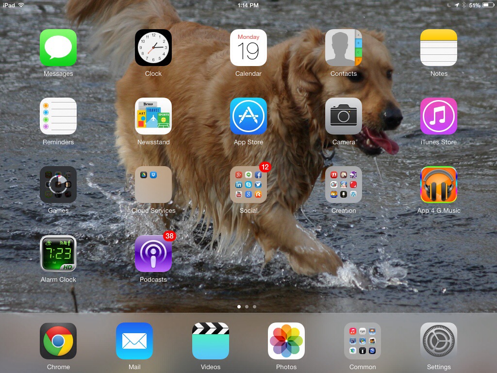
You notice all those blurs? The desktop background there is a picture of a dog…do you feel lighter?
Well, if you don’t, that’s pretty okay, because this design has caused SO MUCH BUTTHURT.
Look at how these icons clash:


That Videos icon! Dat puke green! Dat neon…drunken…shiny…shiny?…stuff…
I recently saw a few videos of people’s reactions to getting an iPhone for Christmas, and they ranged from GETTING UBER EXCITED to crying with joy.
Are they going to start crying when they see ?
I don’t think so. At least not with joy.
Oh and by the way to make all you people feel “better” about iOS 7,
Make of that what you will. Good day sirs and madams.